Alm
I had wanted a personal space on the internet for a long time. I looked at other
people's personal sites, always found them cool, and the urge surfaced now and
then — but it never got past being an urge. I bought the domain aminov.sh six
months ago and let it sit idle for six months.
What finally pushed me was how easy this got. A twenty-dollar subscription, Claude Code, and it does what you ask it to. A week instead of the month-plus that would have gone into "first figure it out". The other push was DHH on Lex Fridman's podcast: we live in a time when the technology keeps getting better and lets you use a computer about as natively as it is currently possible to.
This is not the first iteration. The earlier attempts died not on the code but on the question of what to fill them with.
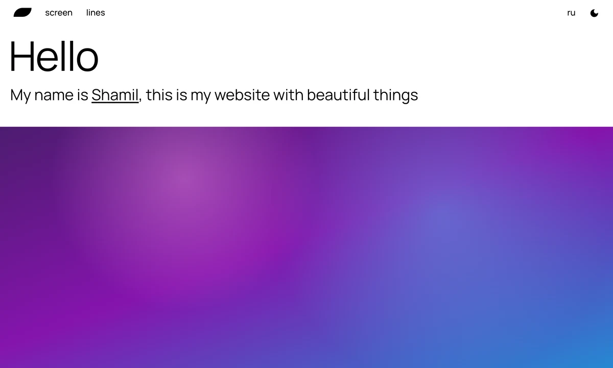
The first was light, with a full-screen gradient and two sections I never thought of anything to put in.
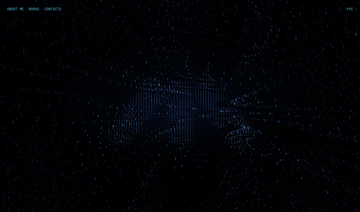
The second was the exact opposite of where I ended up: a black screen and a wall of sixty thousand WebGL particles that drifts on its own and answers to the scroll. Beautiful for about ten seconds, and then you notice there is nothing behind it — not one section I would have kept filling.
What it is against
The modern internet annoys me — not the big sites, those are understandable and built for people, but the small ones. Any utility you need once a month. First half the screen is taken by "we use cookies, please confirm", and I do not want to confirm anything, I want to reject all of it. Then the ads. Then a sign-up through a Google account: two clicks, sure, but what for. I get tracked everywhere and my data pooled together so that I can remove a background from an image.
A site for that should be a field you drop an image into and an image without a background coming back. That is all.
Same story with bloggers. "Join my Telegram channel, buy a Boosty subscription, subscribe here and there." I need a channel exactly when I need it, not sitting in my list permanently; to look and leave you have to subscribe, and the messenger where I wanted to keep personal chats turns into a dump. Too much attention is demanded of me, and too pushily.
My site is not pushy. You can visit it, you can not visit it. It does not save itself anywhere on your side — to come back you have to bookmark it yourself, and that is your decision, not mine. It asks for nothing, counts nothing and will never disturb you. If that sounds like a manifesto — well, to some extent it is.
Everything else follows from that: no analytics, no comments, no login, not a single popup. There is nowhere to write to the site, because there is nowhere to write at all: the content is files in a repository and a build is a folder of static files.
Four sections
Home is a greeting. Somebody landed somewhere, and within ten seconds they should know who I am and what all this is for.
Blog is the thing people start a Telegram channel for, only on my own ground.
Markdown, a file per language, publishing is git push.
Projects is a showcase. A card leads not to a project page of its own but into the blog: if I made something, there is almost certainly a post about it, and a second page about the same thing would drift away from the first on the second edit.
Favorite is films, music, games. It exists for me first: I do not want to forget that I listened to this and watched that and that it mattered. And whoever is curious about someone else's taste can open it and look. There is no "all" tab: a 2:3 poster and a 1:1 sleeve are different shapes, and together they add up to mush.
How it looks
I did design non-professionally, but I did it: headers, covers, mockups. I like things spare, without extra elements. Two things met here — Swiss typography, from a poster I once came across, and Metro UI, meaning Windows 8 and Windows Phone. I even had the idea of buying myself a Windows Phone as an artifact of its era: obsolete, but beautiful. I did not copy; I took the visual language from there and made my own version of it.
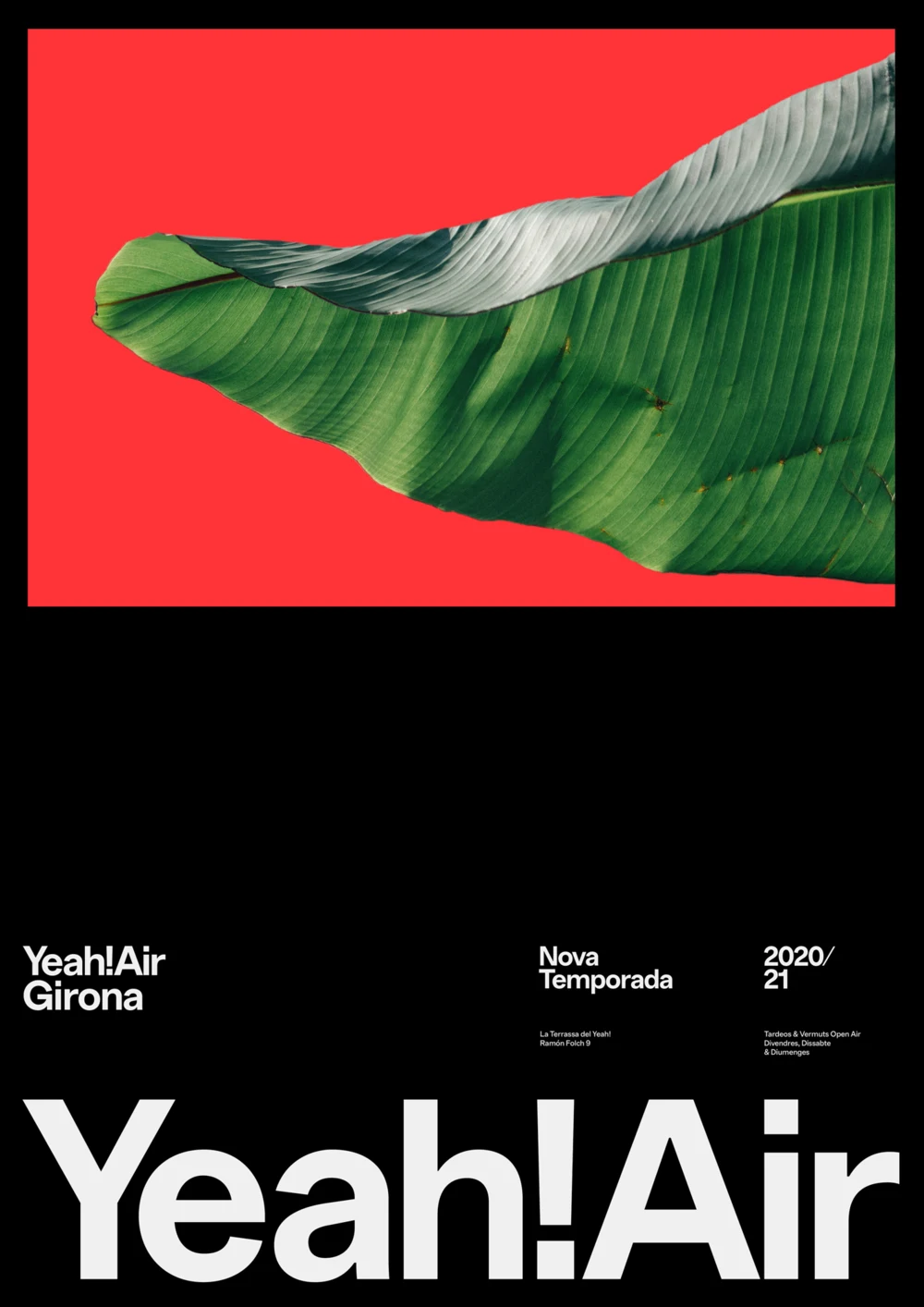
That poster — Quim Marin.
What came out is four type sizes, two colors and a half-tone. Large, medium, small and one more step for the captions under covers — it starts shrinking earlier than the others, because on a phone a seventeen-pixel caption took three lines and the rows of the showcase drifted out of level. Black background, white text, half-tone only where one thing is subordinate to another: the author under a card's title. Inter as the typeface — the base that is everywhere, and that is its merit.
There is not a single icon on the site. Only words and type size.
Which is also why the active item is shown by size and not by color. There are two colors, the half-tone is taken by subordination, there is nothing left to highlight with — so the current item is simply one step larger. The same move in the header and in the tabs.
There was a light theme, and I removed it: I did not like it.
The header, which took the most
A small component, you would think. It took more time than all the pages put together.
On a desktop the items are set small, and the one under the cursor grows smoothly. Sounds simple, but size moves the layout: an item grows, pushes its neighbour, the neighbour slides out from under the cursor, the state drops, everything travels back. The header shivered while the cursor sat a hair away from a letter. I had to stop asking the browser what the cursor is over and work it out myself.
On a phone the sections simply do not fit. I did not want to wrap them onto a second line — then navigation takes a quarter of the screen and stops reading as a row — so the row travels sideways instead, like a panorama in Windows Phone. That is why on a narrow screen it is larger, not smaller: at a small size four words almost fit, and there was nothing left to turn.
The row also turns itself: the current section stops not at the edge but a step inside it, so the tail of the previous one stays visible and fades into the dark. The order of the sections is a map, and it should show where you stand relative to your neighbours.
And there is a spring at the edge: a sharp swipe hits it like a wall, and a short bounce makes the stop feel alive. It is also where the dumbest bug in the whole project turned up. The browser rounded two numbers in opposite directions, so the row, having travelled all the way, believed one pixel of travel was still left — and nothing on the right worked at all. On the next section the numbers agreed, and for half a day I was sure the section was to blame.
And the swipe between pages. The site is nicer to use from a phone than from a computer, and that did not happen by itself either.
Why it is a template
I did not want to build a site that only fits me. So it came out as two repositories: the template is out in the open, and my site is a separate repo with my content in it. Everything that makes an installation yours sits in one file: name, address, languages, sections, kinds of favorites.
The second part matters more to me: you clone it and you get a working site. Nine posts, eight projects, eight cards for every kind. Not an empty frame — a filled one.
This one comes from a sore spot. The same thing keeps coming up at work: there is a production database and there is a local one built from seeds, and everybody neglects the seeds — nothing checks them and over time they turn to mush. Half the errors during development come from some data simply not being there. I wanted the demo content to show the whole site, and I wanted eight cards to show what two cannot: scrolling, rows, wrapping. The names in it are deliberately nothing — "Project 3", "Film 7": the name of a real place or person starts pretending to be content, and people edit it instead of replacing it with their own.
In the end
I built the site for myself and I am happy with the result. The loop is closed: the domain has stopped sitting idle, there is a place that looks the way I want, and all that is left is to fill it — without asking anyone's permission and without depending on anyone.
Maybe in a year my view will change and I will build something more elaborate. For now I like it exactly like this.
9/2/2026